Have you ever wondered how the name Globant came about? Or where did the “Technology that dares to delight” tagline come from? Or why do we use an arrow in the logo, or have green colors? In this article, you’ll find a little bit of the background of our brand story.
Globant in the making
Four friends in a bar. That’s how our story began back in 2003. They shared a common dream that we still pursue: to become the best company in delivering profound digital transformations for organizations while generating career opportunities for IT professionals throughout the world.
The company name had to reflect this. Even though Nestor Nocetti, one of the co-founders, used to jokingly remark that it came about partly due to what was a leftover .com domain name. Globant was a wordmark they identified by creating a computer program that searched available web addresses using some predefined combinations. At the time the company was founded, several technology companies had names ending in “NT.” So the founders decided to explore different options that ended in the same letters. The result was not unintentional:
GLOBAL + NT = GLOBANT
The founders wanted the name to demonstrate a global perspective in different senses. The global perspective was primarily demographic, but also demonstrated how the company could help clients worldwide transform in various industries using emerging technologies.
The name was very well accepted and a bit catchy too!
Our main taglines
Throughout our more than twenty years, we’ve used three different slogans that best represented the company: “We are ready,” “Seek Reinvention,” and “Technology that dares to delight.”
“We are ready” was our first one and related to our think-big mindset. In the early days of Globant, the message sought to capture our entrepreneurial spirit while emphasizing that our culture enable us to be available and prepared to meet customers’ needs. “We are ready” is a flag that continues to symbolize how Globant and our Globers are ready for change, innovation, and the future.
“Seek Reinvention” appeared later to emphasize that it has never been more important for businesses, societies, and humankind to reinvent themselves as we the pace of technological, climate, and social change is always increasing.
What role is Globant playing in this landscape? Globant is, and has always been, a company focused on reinvention. Reinvention is in our DNA. It’s what we do. It’s why we exist. We believe that the success of any company is rooted in its ability to reinvent itself. That’s why we’ve been enabling reinvention for our clients since we were born, helping them create a way forward into a sustainable future.
Unveiled in early 2024, “Technology that dares to delight” is the tagline that currently represents us best. As a digitally native company, we are passionate about the profound ways that tech can change industries, experiences, and lives. That’s why, for the last 20 years, we have been dedicated to creating digital products that consumers love. We’re the visionary builders behind some of the world’s most innovative technologies. We dare to go far; we dare to delight.
The Star: Our logo now and then
Now, let’s talk about our logo, it’s the star of our brand. The visual concept represents our ideas, values, and mission.
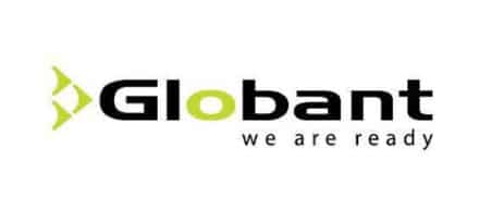
Our original logo

Globant’s brand story 3
O = The world is our goal
> = the direction that we want to go
When we looked at other tech company logos in the industry, we noticed that the typical pattern was to use a sober and not-so-flashy color pallet. We wanted to demonstrate clearly that we are different. So the color green has become a key part of Globant’s identity, and its unconventional pictogram reflects innovation and disruptiveness.
The creative process, similar to the creation of Globant’s name, was swift. We considered our mission and objectives and understood that the brand had to reflect the idea of thinking big and always being ready for the future.
Consistency, clarity, and accessibility have also all been foundational aspects in building the brand. Our communications are based on an underlying design that allows us to maintain continuity in what we do.
Our new logo

At Globant, we are constantly evolving. In 2019, we decided to launch our new and revised logo to have a more modern image. It was a requirement to respect the main traits of the original logo, in particular, its colors and visual imagery. So we made a few edits, changed the typography and placed the arrow towards the right, representing movement towards the future. This was the result:
Globant is a vibrant, ever-changing, and adaptable company, but our values and brand essence remain steadfast: We are ready.
Curious to read more about our brand guidelines, the “Green Book”? It’s available for everyone to see. Check it out here!


