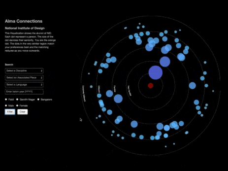
Today, creating relevant and easily understandable content is more important than ever. Visual storytelling and data visualization effectively communicate complex information in a compelling format. By using visual elements, organizations can improve understanding, engagement, and retention of key messages.

What is Data Visualization?
Data visualization turns numbers and statistics into visually digestible formats. From graphs and charts to interactive dashboards, it helps spot patterns, trends, and outliers hidden in massive data sets. For industries like pharmaceuticals, this practice plays a crucial role in making informed decisions. It allows teams to work together more efficiently, transforming raw numbers into impactful visuals that improve collaboration between pharma companies, healthcare providers, and brands.
1. Simplifying Complex Information
Data visualization bridges the gap between different departments in industries where teams must align on strategy. Visuals make technical and complex medical information more accessible for everyone to understand. For healthcare professionals, it uncovers trends and insights that would be missed in spreadsheets. This ability to break down complex data into clear visuals speeds up decision-making and encourages more

2. Enhancing Patient Care
When it comes to patient care, visual data can be life-changing:
- Personalized treatments: Visualizations help craft treatment plans tailored to individual patient data.
- Early detection: Spotting subtle shifts in patient information becomes easier with visual aids, allowing healthcare professionals to take action sooner.
- Patient education: When explaining complicated medical concepts, doctors can simplify the message using visuals, helping patients better understand their health and follow through with treatments.
3. Data Visualization Across Industries
It’s not just healthcare that benefits from data visualization. In fintech, massive data is turned into clean, interactive formats—think graphs and dashboards—making it easier to identify patterns and trends. Engineering also uses visual tools to assess complex systems and optimize processes, improving overall efficiency.
4. Latest Trends in Data Visualization
Data visualization is evolving, and new technologies shape how we interact with data. Here are some of the current trends:
- Interactive Visuals let users dig deeper into specific data points and explore various outcomes. It’s not just about looking at the data but engaging with it in real time.
- Mobile Optimization: With more people relying on smartphones, visuals are now designed to be mobile-friendly, so insights are accessible from anywhere.
- AI and Machine Learning Integration: AI is revolutionizing visualizations by automating their creation and providing predictive analytics. This saves time and boosts accuracy, offering even more meaningful insights.
- Big Data Visuals: As data sets grow more prominent, advanced visual techniques like heat maps and interactive dashboards make it easier to explore and understand the data.

5. Best Practices for Effective Visuals
Creating impactful visualizations requires more than just pretty pictures:
- Know your audience: Tailor your visuals based on who will be viewing them and their level of expertise.
- Choose the right format: Different types of data call for different visualization styles. Make sure you’re using the right one to get your message across.
- Stay on brand: Your visuals should align with your brand’s overall look and feel, creating a seamless experience.
- Keep it clear: Avoid overcomplicating your visuals. Use design elements strategically to emphasize essential information without overwhelming the viewer.
- Add context: Annotations and descriptive text provide clarity and help convey the story behind the data.
- Use visual hierarchy: Guide your audience’s focus to the most critical parts of the data, leading them through the story step by step.
In the pharmaceutical industry and across many others, data visualization is more than just a tool—it’s a strategy. It fosters better communication, quicker decision-making, and stronger collaboration. Whether improving patient care or optimizing business operations, visuals transform raw data into understandable, actionable insights. At Globant GUT, our experts specialize in creating engaging data visuals that enhance user experience and drive real business results.
With data playing an ever-growing role in business and research, visual storytelling is here to stay, helping us all make smarter, faster decisions.


